01 The Opening
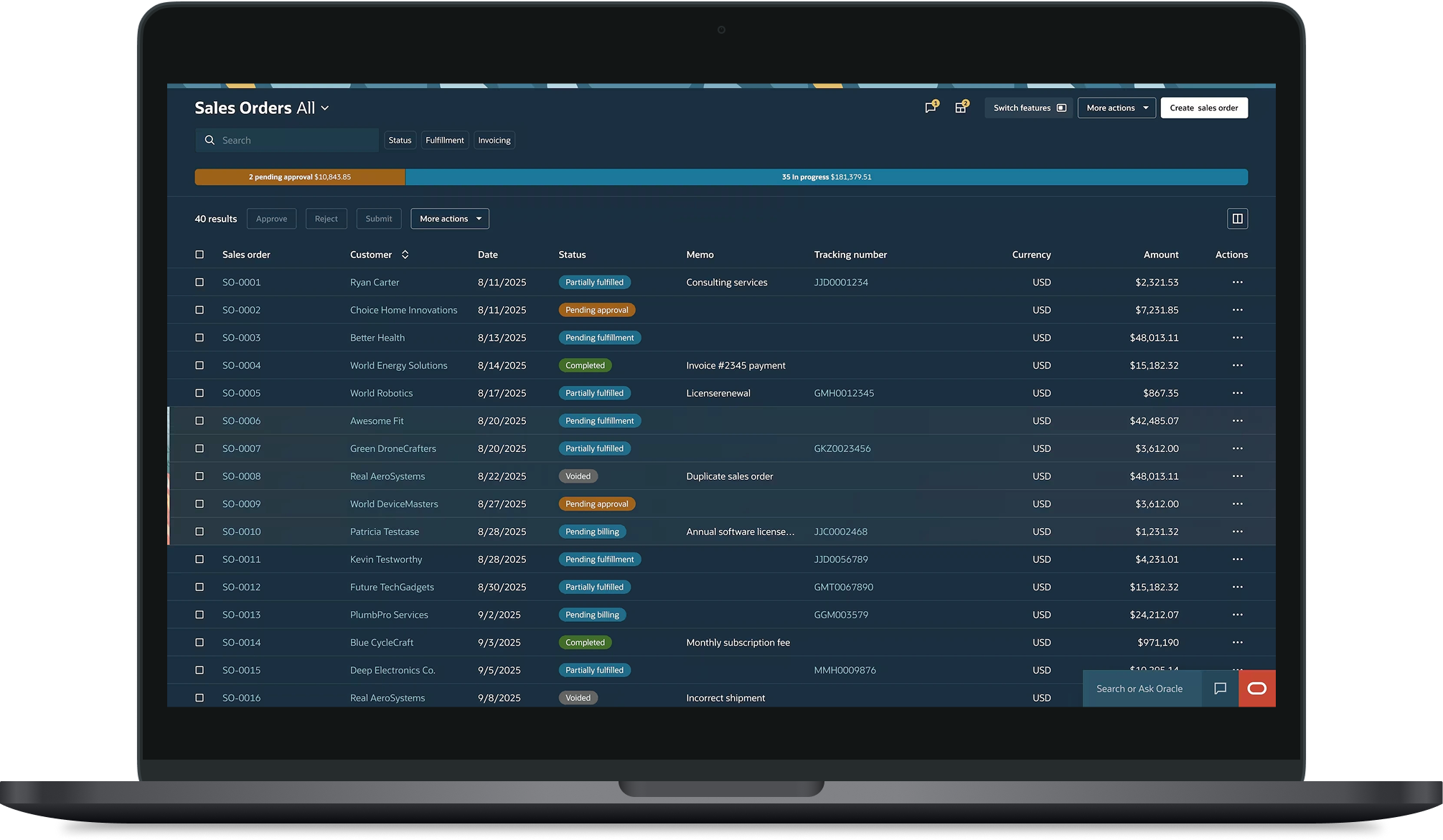
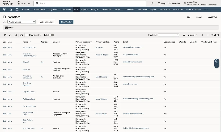
Users of enterprise ERP platforms — finance administrators, inventory managers, operations teams — spend a significant part of their working day inside list interfaces. Not occasionally glancing at them. Actively working in them: finding records, acting on them, managing hundreds of data points simultaneously.
The list interface sits at the centre of that experience. And because it’s a shared component that other parts of the product build on top of — decisions made at this level don’t stay contained. They carry through across every context, every user who inherits what gets built here.
The starting point for this project was a clear signal. Users were experiencing column overload and cognitive fatigue — too much data presented simultaneously, not enough structure to help them find what mattered quickly. The goal was to explore what grouping and filtering capabilities would genuinely help, and how to prioritise them without overwhelming users with options they didn’t need.
What we found along the way changed how we thought about the problem entirely.
02 Who We Were Designing For
This project focused on small business owners and their teams — people managing inventory, processing transactions, chasing outstanding tasks, with high context switching and limited tolerance for complexity. They move fast. They get interrupted constantly. When they open a list interface they need to find what they need, act on it and move on.
Every unnecessary option, every extra column, every capability that doesn’t serve their immediate task is friction they can’t absorb. A feature that makes sense for a data analyst building a report can be genuinely counterproductive for a small business owner trying to clear their task list before lunch.
The design challenge wasn’t just what grouping and filtering capabilities to build. It was which ones were actually worth the cognitive cost of putting in front of these users — and which ones belonged somewhere else entirely.
03 What We Did to Find Out
We approached this as a discovery project combining multiple methods across an extended period of time.
Contextual inquiry studies gave us a window into how users actually interacted with list interfaces in their working context — not how they described their behaviour, but what we could observe directly. What they were trying to accomplish, where they slowed down, where they skipped over capabilities entirely, and where they worked around the interface rather than through it.
A usability study testing the redesigned interface gave us structured evidence around specific grouping and filtering interactions — what users noticed, what they used, what they ignored and what confused them.
Together these methods gave us both the broad behavioural picture and the specific interaction evidence needed to make defensible recommendations.
04 What We Learned
Across the research activities, a consistent pattern emerged in how users interacted with list interfaces in fast-paced operational contexts.
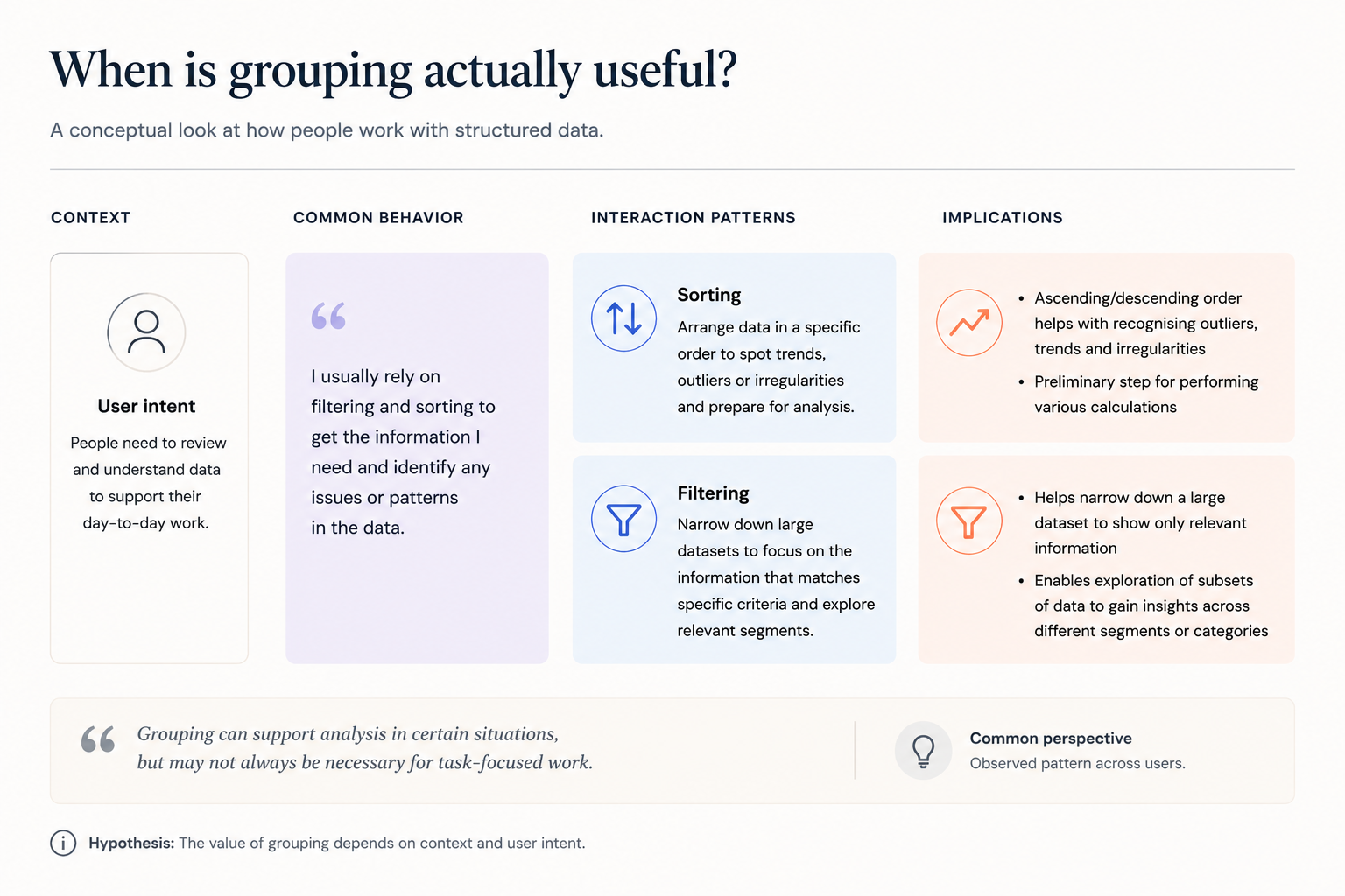
Users were not approaching the interface as a space for analysis. They were using it to complete immediate tasks — finding specific records, taking action, moving on. Their behaviour reflected a strong preference for speed and clarity over configurability.
Two themes shaped the design thinking most directly.
The first was the value of regaining control quickly. Users consistently looked for simple ways to reset their view — returning to a clean starting point without having to reverse individual steps. That preference for recoverability was a stronger signal than enthusiasm for additional features.
The second was how much context shapes perception. Interactions that feel useful in exploratory or analytical scenarios don’t always translate into environments where users are moving fast and managing immediate tasks. In those contexts, additional structure can feel like an obstacle rather than support.
Together, these observations helped clarify what kinds of interactions were genuinely aligned with how users were actually working in this part of the product.
05 How the Thinking Evolved
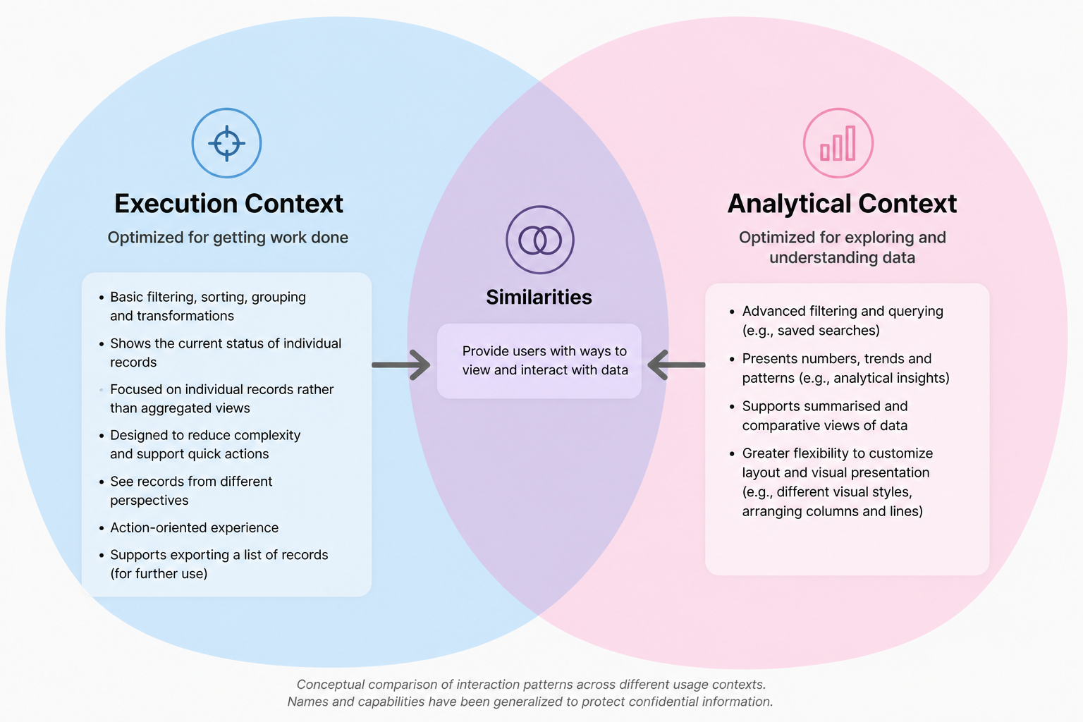
As the research progressed, a question emerged that hadn’t been the original focus of the work: what is a list interface actually for, compared to other parts of the product that surface similar data?
Looking at different list interfaces side by side helped clarify an important distinction. Some experiences in the product were designed for analytical work — users exploring data, building views, comparing across dimensions. Others were designed for operational work — users managing tasks, acting on records, moving efficiently through their day.
That distinction helped reframe the design question. Rather than focusing on which additional capabilities to introduce, the exploration shifted toward understanding which interaction patterns were genuinely aligned with the pace and intent of everyday use in this context.
From there, the design direction moved toward experiences that reduced the need for on-the-fly configuration — surfaces that arrived already shaped around the most immediate user tasks, rather than requiring users to organise the interface themselves before they could work in it.
06 Where the Work Led
The research and collaborative exploration pointed toward a clearer design direction — one focused on reducing the configuration burden for users working in fast-paced operational contexts, and on surfaces that arrived already structured around common tasks rather than leaving that work to the user.
The recoverability finding reinforced a broader principle: that simplicity and control were higher priorities than feature richness in this context — and that adding capabilities without considering the cognitive cost can work against the users you’re trying to serve.
The full implementation journey continued beyond my direct involvement. What I can speak to is the thinking that shaped the direction — and the value of being present for that thinking as it developed, not just delivering findings into a process that had already moved on.
07 Looking Back
This project is the one where I came closest to operating as a product designer rather than a researcher feeding into a design process. Being embedded in the collaborative work — not just delivering findings but actively participating in how the problem was framed — made a real difference to what came out of it.
What I’d want more of is exactly that. Earlier and more continuous presence in the design exploration rather than arriving at defined moments. The contextual inquiry findings were stronger because I was embedded enough to understand the product context deeply. The collaborative reframing worked because I was present when the thinking was happening — not after conclusions had already been reached.
The research informed the direction. But being present for the thinking is what made it count.