01 The Opening
Most design briefs start with an existing product or an established organisation. This one started with neither.
The Asociación Cultural Checa de Galicia was a community before it was an association — Czech families and individuals meeting informally in Galicia, connected by language, culture and the specific experience of living far from home. When the decision was made to formalise it — to register it legally with the Xunta de Galicia, to give it an official structure — the website became necessary not as a marketing tool but as proof of existence.
It needed to do several things simultaneously. Signal legitimacy to institutions and potential partners. Communicate warmth to families considering joining. Speak to individuals looking for cultural depth rather than children’s activities. And do all of this for a community that was still forming, with zero budget, no team and no existing visual identity.
The designer and the client were the same person. Which is both the greatest possible advantage and the most significant design risk.
02 The Brief
The website needed to answer three questions for anyone landing on it cold.
What is this association and why does it exist? Who is it for? And how do I get involved?
But beneath those questions sat a more specific design challenge. The association was legally new but emotionally established — people had already been meeting, forming relationships, building something together informally. The website needed to communicate that warmth and history while simultaneously establishing the credibility and official structure that a registered association requires.
Too formal and it would feel cold and bureaucratic — the opposite of what the community was. Too informal and it would fail to signal the legitimacy needed to attract new members and potential institutional partners.
That tension — between official and human — shaped every design decision that followed.
03 Two Audiences, One Website
From the beginning it was clear the website needed to speak to two meaningfully different people with different reasons for arriving and different questions they needed answered.
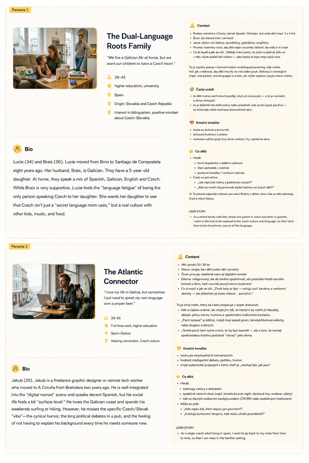
The Dual-Language Roots Family — a Czech mother, a Galician father, young children. She wants her daughter to experience Czech as a real culture, not just a language mum uses at home. She’s looking for families, children’s activities and a community that makes that feel possible.
The Atlantic Connector — a single Czech expat, well integrated into Galician life but missing something specific. The particular Czech humour, the debates, the feeling of not having to explain yourself. He’s looking for depth not surface.
Same website. Completely different questions being asked of it.
A decision had to be made. Trying to serve both audiences equally with limited space and no budget would mean serving neither well. The primary persona became the family audience — more immediately visible needs, more concrete content to show. The individual expat audience was accommodated through messaging and event descriptions but the visual language skewed toward families.
That decision solved one problem and created another — one that the testing later made visible.
04 The Design Decisions
Building the brand identity from scratch meant making decisions that would define how the association was perceived before a single person walked through the door.
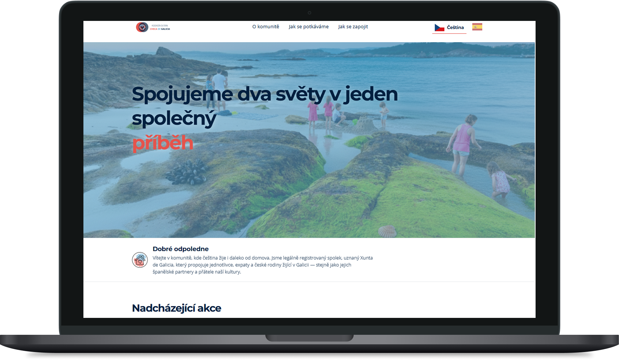
- Visual language. A warm but structured colour palette — dark navy and red accent — chosen to signal both friendliness and credibility simultaneously. The hero headline ‘Spojujeme dva světy v jeden společný příběh’ established the dual-world narrative immediately. Typography was used to create emotional hierarchy — not just visual hierarchy.
- Content architecture. Three primary navigation destinations reflecting the three questions every visitor arrives with. About the association. Upcoming events. How to get involved. Everything else was secondary.
- The lifecycle decision. The website was deliberately scoped to match where the association is today — a kick-off presence designed to attract first members and establish legitimacy. It is not trying to be what the association will become in three years. A formal review is planned in one year to assess whether a redesign is needed as the community matures. This was a conscious product decision — design for current reality, plan for future evolution.
- Technical execution. Built and hosted on GitHub Pages. AI coding tools used pragmatically to execute front-end decisions that would otherwise have required a developer. Not a shortcut — a resource decision that made the project possible within real constraints.
05 Testing With Real and Synthetic Users
Designing for a community you lead creates an inherent blind spot. You know too much. You assume too much. The people most likely to validate your decisions are the people who already agree with them.
To compensate for that, a structured testing protocol was run with four real participants and supplemented with synthetic user testing.
- Two family-focused participants representing the primary persona — Czech mothers with children living in Galicia.
- One individual expat participant matching the Jakub persona — a single Czech adult integrated into Galician life but seeking cultural connection.
- One subject matter expert — a cultural attaché from the ministry of foreign affairs — included specifically to validate whether the association felt credible and officially legitimate to someone whose professional role involves exactly that judgment.
The same protocol was run through synthetic users fed the two persona profiles with identical prompts — a pragmatic approach to stress-testing findings from a small real user sample under zero budget constraints.
Participants were asked for first impressions, main blockers and whether they could describe the association’s goals in their own words. They were then asked to navigate freely and note anything that felt odd or interrupted their exploration.
06 What Testing Revealed
The testing surfaced issues across three areas.
An interaction failure on mobile — the flip card pattern worked on desktop but was invisible on touch screens. Fixed by showing content immediately on mobile while keeping the interaction on desktop.
A readability failure — monotonous text causing users to miss key information. Fixed through typographic hierarchy.
Two messaging gaps — the individual expat audience not feeling fully addressed by the current visual language and content framing, and conversion blockers around team size and time commitment for potential volunteers. Both identified and planned for the next iteration.
07 Where It Stands
The website is live. The association is active. Events are being organised and attended. The community is growing.
The design is doing its primary job — establishing a credible public presence for a newly official association and giving potential members enough to make a decision about whether this community is for them.
What it hasn’t fully solved is Jakub. The individual expat audience is acknowledged but not yet fully served. That’s the known gap going into the next iteration — alongside the conversion fixes identified through testing.
The planned annual review will assess whether the current design still fits where the association has reached. If the community has grown significantly, if events have accumulated, if the archive of shared history has become substantial enough to show — the design will need to grow with it.
That review is built into the plan. Not as an admission that the current design is insufficient. But as a recognition that a product should reflect the organisation it represents — and both of them are still becoming what they’ll be.
08 Looking Back
The hardest part of this project wasn’t the technical constraints or the zero budget. It was maintaining critical distance from something I care about personally.
The testing discipline helped — having real participants and a structured protocol created the separation that being both designer and president made difficult to achieve naturally. The synthetic user testing added another layer of distance by forcing explicit articulation of what each persona needed before evaluating whether the design delivered it.
What I’d do differently is resolve the Jakub problem earlier. The primary persona decision was correct. But I underestimated how much work it would take to serve the secondary persona through messaging alone when the visual language was already pointing somewhere else. That’s a tension I’d address in the first version rather than deferring to the next one.
The broader lesson — designing for a community you belong to requires you to be more rigorous about process, not less. The emotional investment that makes you care about getting it right is the same thing that makes you blind to where you got it wrong.