01 The Opening
The product was in the middle of a significant interface transformation. The goal wasn’t just a visual refresh — it was an adoption of a new enterprise-wide design system, a company-wide UI framework built to unify the experience across a broad product portfolio.
Our team sat at an important intersection in that process — responsible for ensuring that components from the new system actually worked for this product’s specific users and use cases before they were built on top of across the wider product. We were the bridge between what the design system provided and what our users needed.
Early in that process we identified a concern. A small one on the surface. But in an enterprise ERP platform where users complete dozens of forms daily — financial transactions, inventory records, operational data — small usability failures at the component level don’t stay small. They scale with every form, every user, every team that builds on top of that component.
The concern was about required fields. Specifically — how they were being shown to users. Or more accurately, how they weren’t being noticed.
02 The Background
The interface redesign wasn’t just about aesthetics. It was a migration from a legacy UI into a new enterprise design system — a mature, well-resourced framework built with real design rigour.
But built for a broad product portfolio — not for this product’s specific user base.
The users of this product are a specific audience — finance administrators, operations teams, inventory managers — people who live inside complex record forms for hours every day. What works at a general platform level doesn’t always translate cleanly into that context.
Our role was to validate components against real use cases before they were inherited more broadly. If a component had a problem at our level, that problem would carry through across every form, every record type, every team that built on top of it. That’s the weight a shared global component carries.
03 The Problem
The required field indicator was one of those shared components. In the new design system, mandatory fields were marked with assistive text — the word “Required” in grey, placed beneath the input field. No asterisk. No colour contrast signal. A quiet, minimal pattern consistent with the system’s overall aesthetic direction.
Early qualitative usability testing was sending a consistent signal. Participants were verbalising confusion about required fields. They were looking for something that wasn’t there — specifically, a red asterisk. Some weren’t noticing the grey label at all. A few didn’t realise required fields existed on the page even when they were clearly marked.
The pattern was consistent enough to form a clear hypothesis — users have a significantly stronger perception of required fields when indicated by a red asterisk than by grey assistive text. The placement made it worse: the grey label sat to the far right of the field, visually separated from the field label itself, easy to miss when scanning quickly through a dense form.
We needed to validate this properly before escalating. A gut feeling and a small qualitative study wasn’t going to move a global component.
04 The Study
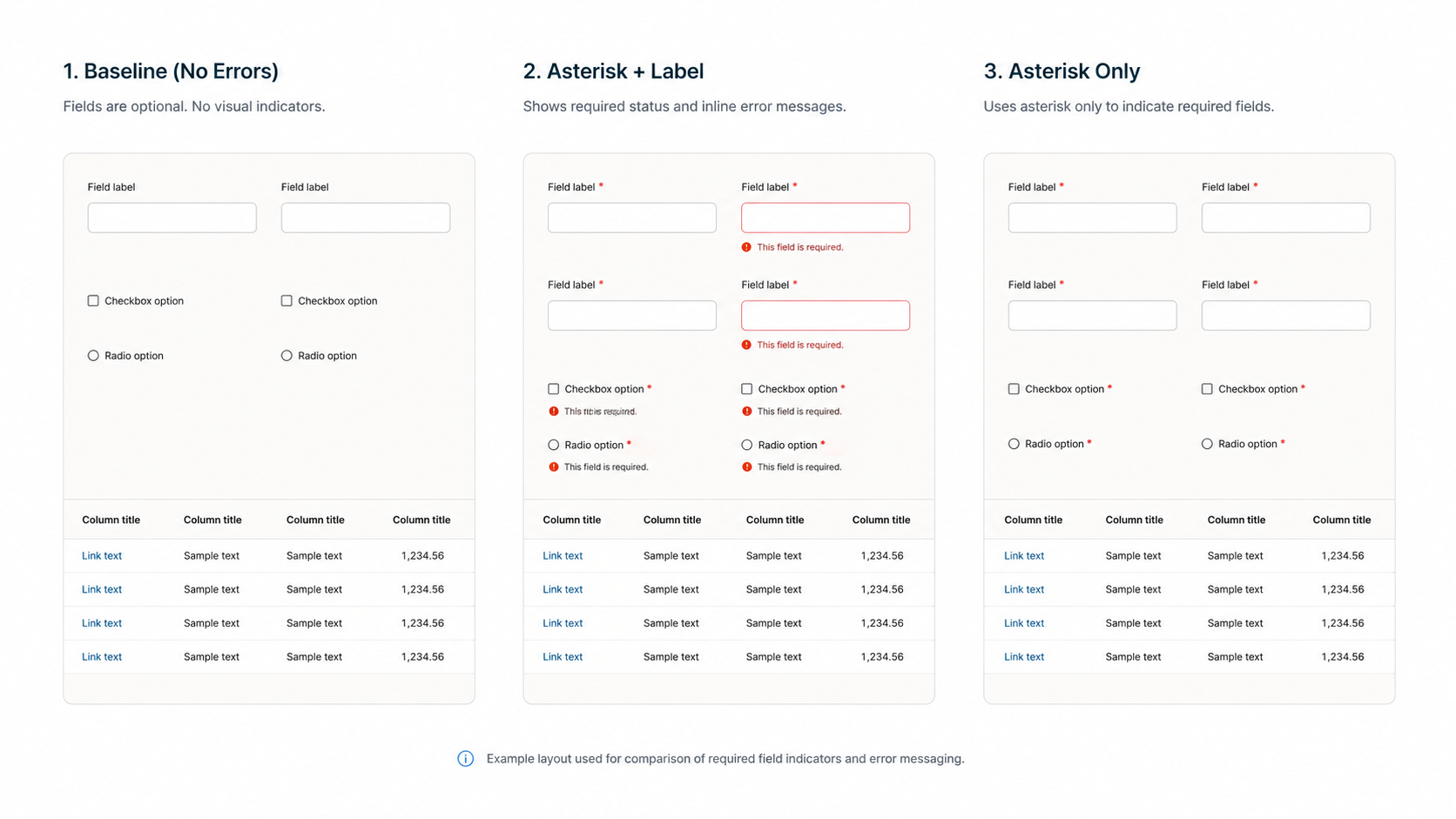
To move beyond early qualitative signals we ran an unmoderated usability study testing three variants of the required field indicator independently, with separate participant groups for each condition to avoid direct comparison bias.
The three variants were: the current design with grey assistive text reading “Required” placed below and to the far right of the input; a red label combined with a red asterisk; and a red asterisk only.
We evaluated each variant across two dimensions — recognition speed and perceived familiarity — captured through participant ratings alongside think-aloud commentary.
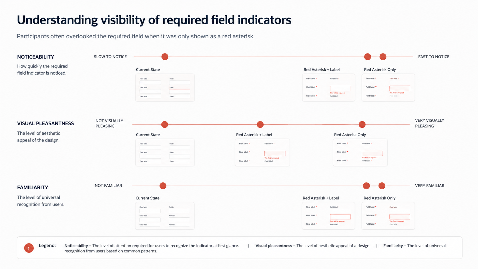
The current design condition produced the clearest signals of confusion. Participants described not noticing required fields at all, misremembering what indicator they had seen, or only realising after the fact that the marking convention was different from what they were used to.
The red asterisk conditions told a different story immediately. Participants recognised it without hesitation, described it as expected and familiar, and needed no adjustment to understand its meaning.
The pattern across all conditions was consistent. The red asterisk was recognised quickly and required no learning. The grey label was frequently missed, misremembered, or noticed only after the fact.
05 Taking It Forward
With the study results documented, the findings were presented to the design system team responsible for the component — drawing on both this unmoderated study and the earlier qualitative testing that had first raised the concern.
The response was measured and considered. A change to a global component at that level carries real consequences across a large and complex product ecosystem. The team needed more robust data before committing to anything. That’s a legitimate position — design system decisions at enterprise scale are not made lightly, and we understood the ask.
What became clearer over time was how much the path from finding to decision is shaped by factors beyond the quality of the evidence itself.
06 What the Experience Revealed
The research was sound and the findings were clear. What accumulated over the follow-up period was something more interesting — independent signals from real users in production encountering the same problem and reporting it through their own channels. Each one an unprompted, unsolicited data point that continued building the case made by the original study.
That pattern — of evidence accumulating from multiple independent sources — is itself a meaningful research outcome. It reinforced confidence in the original findings and reframed the question: not whether the problem existed, but what it would take for the organisation to act on it.
07 Looking Back
The research was sound and the findings were clear. What I underestimated was the organisational dynamic involved in changing a shared component in a large enterprise design system.
The design system team wasn’t wrong to ask for more evidence. A change at that level affects every product built on the system. That’s a real constraint and a legitimate one.
What I would approach differently is understanding that organisational dynamic before we started rather than after. Mapping who the decision makers were, what evidence threshold they actually needed, and what the change process looked like inside that team — and then designing the study around those requirements rather than presenting findings into a process we didn’t fully understand.
That gap — between solid evidence and organisational action — is its own design problem. It has stakeholders, constraints, decision points and failure modes just like any other design problem. And like any design problem, it responds better to deliberate planning than to hoping the quality of the work speaks for itself. That’s something I’ve carried forward.